Aveituna Kitchen / Autumn Grace Photography
I get asked for kitchen design advice a lot. There are so many decisions, and it can be hard to envision how everything will come together. One question that comes up a lot is “Should I paint my island a different color?” This has been a major kitchen trend in the last few years and one that we love. It adds contrast and keeps the space interesting. However, if you are leaning toward keeping everything one color, that’s a look to love as well. Scroll down to see different ways we’ve created contrast with the island, and how we’ve kept things interesting in kitchens painted all one color.

Contrasting Islands
Family Ties Custom Build / Rebekah Westover Photography
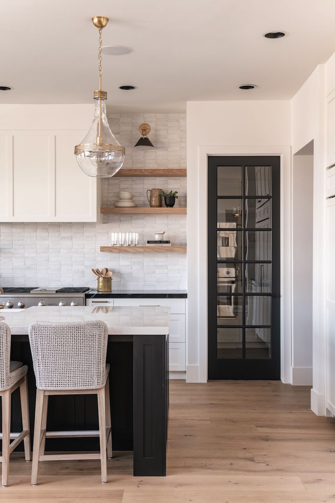
Our Family Ties kitchen uses a crisp layering of black and white. The foundation of this look is white walls and cabinetry painted Benjamin Moore Chantilly Lace paired with the island and pantry door painted Benjamin Moore Black Panther. The tuxedo look is warmed by open shelving and sections of cabinetry in natural wood. We often keep our permanent styling neutral and then add color through accessories. Our favorite pallette is black, white, and wood. But a contrasting island in another neutral like taupe, or a fun color like green would also be beautiful.
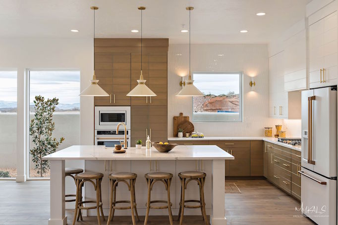
Double Eagle Project / Mykals Architectural Photography
Our Double Eagle Project kitchen is a layering of white and wood. The cabinets are custom v-groove with the uppers painted to match the walls, Benjamin Moore Chantilly Lace, and the lowers stained to match the floor. The island, painted Chantilly Lace, ties in with the uppers and contrasts against the natural wood of the lowers.
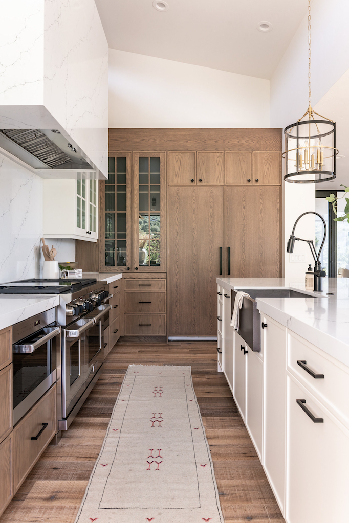
Summit Creek Project / Rebekah Westover Photography
The cabinetry in our Summit Creek Project is again two tone, with warm wood and fresh white. The mix creates a more interesting space that still feels crisp and clean. We used Benjamin Moore White Dove in a Satin Finish on the island and upper cabinets.
Matched Islands
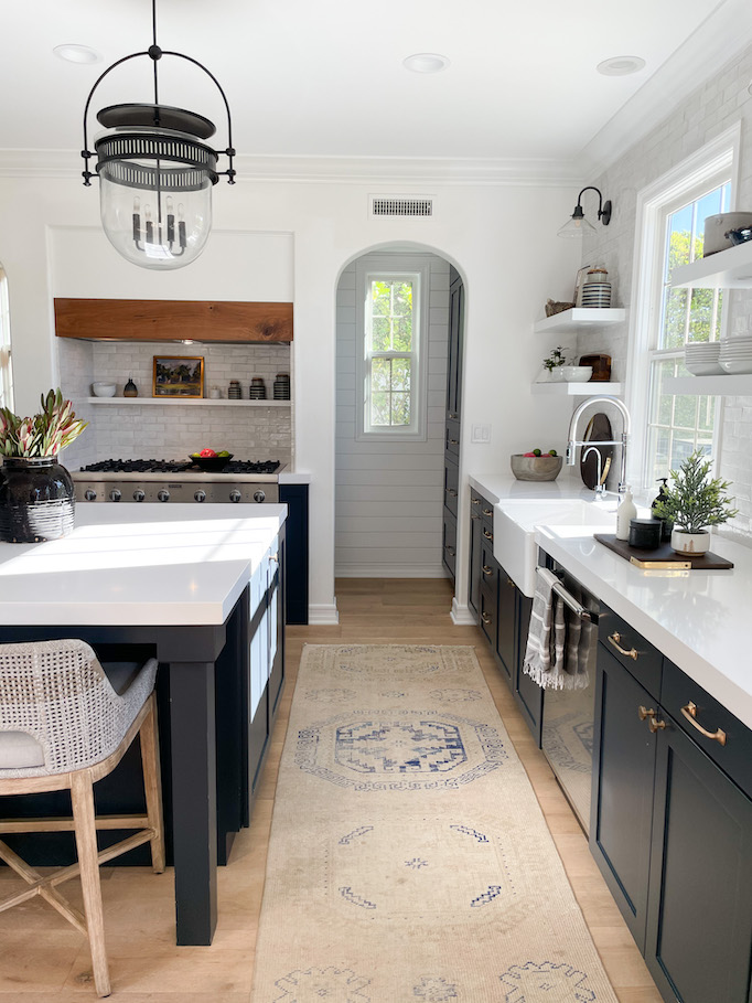
Aveituna Kitchen / Autumn Grace Photography
All the cabinetry, including the island, in our Aveituna Kitchen is painted Benjamin Moore Smoke Embers. The uniform cabinetry allows the incredible patterned tile from Tabarka Studio to be the focus. We then added interest and warmed the gray with brass hardware and a contrasting range hood in natural wood.
The island and cabinetry in our Torina Project are a matched Dunn Edwards Salem Black. Although there are no upper cabinets in this space, white painted open shelving creates a pretty two tone effect.
Vidriosa Kitchen / Autumn Grace Photography
Our Vidriosa Kitchen is a two tone layering of white and warmth, with the island and cabinetry providing a white backdrop with wood and brass accesnts layered throughout. A few black highlights keep the space interesting.
Villa Bonita Project / Alyssa Ence Photography
The walls and cabinetry in Villa Bonita are painted my go-to white, Benjamin Moore Chantilly Lace. This is a beautiful cool white that reads clean and bright. To keep the space from feeling one-note, we created contrast with the countertops. For the island, we used quartz, Caesarstone in London Gray This is a beautiful low-maintenance white marble alternative. We paired it with dark quartz around the perimeter of the kitchen, Caesarstone in Piatra Gray.
Brio Project / Alyssa Ence Photography
Our Brio Kitchen is painted Sherwin Williams Grey Matters. To add interest, we added cement tile to the island.
Sometimes just seeing a look helps you realize what you want in your own space. Hope this gives you ideas!
Xxo
Becki
Shop the Post


