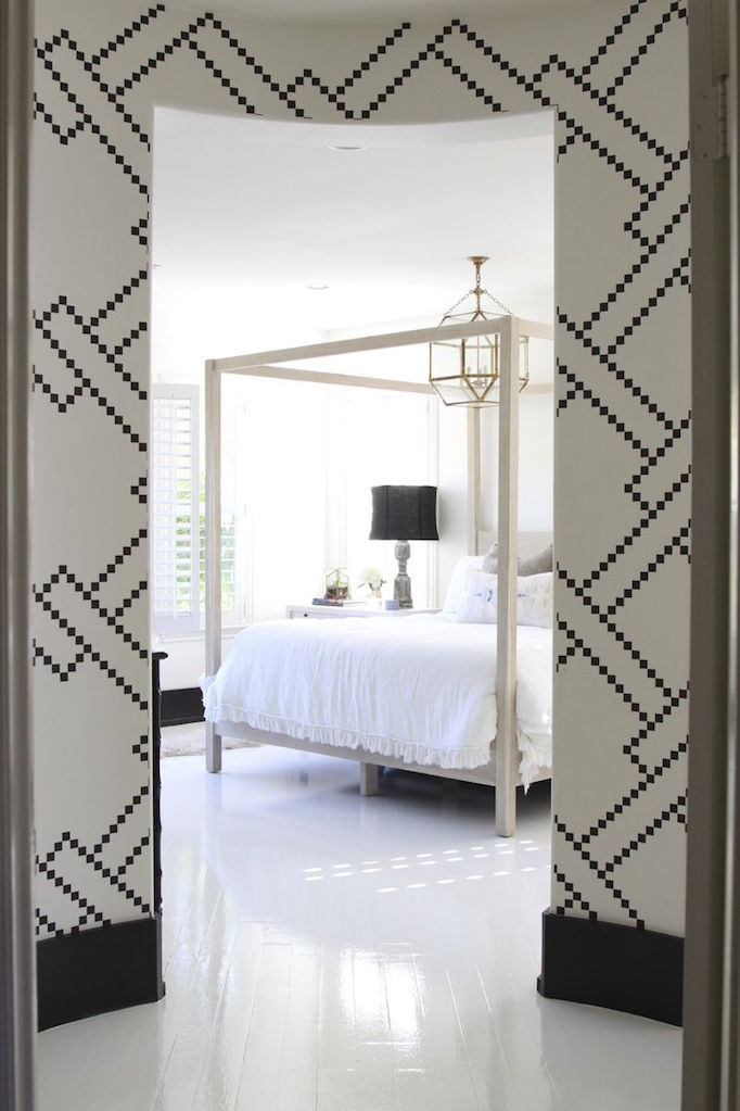
We love fresh and airy look of a crisp white paint and often use it as our go to paint color in our projects. Our favorite is Benjamin Moore Chantilly Lace. But lately, we have been adding other neutral shades of paint into our projects and love the sophisticated depth that warmer whites, deeper neutrals, and richer grays add. Take a look at a few we’ve used in recent projects!
Benjamin Moore Seapearl

In the airy spacious spaces of our Pura Vista Projected, we used the warm off-white Benjamin Moore Seapearl to ensure the rooms felt cozy and not cavernous. IT has soft gray undertones that create warm depth.
Benjamin Moore Gray Owl

For subtle contrast against the white walls and warm woods n our Hawaii Project, we painted the upper cabinets Benjamin Moore Gray Owl. This is a very light gray with a crisp cool tone.
Benjamin Moore Silver Song

Benjamin Moore Silver Song is the prettiest soft neutral gray. It adds softness and sophistication to the light and airy space.
Benjamin Moore Dolphin

The butlers pantry in our Golden Hour Project is painted Benjamin Moore Dolphin. This soft gray sets the space apart from the adjoining white kitchen painted Benjamin Moore Chantilly Lace.
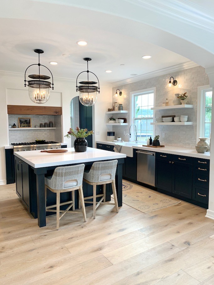
Benjamin Moore Kendall Charcoal

Benjamin Moore Kendall Charcoal is a rich, pretty gray that works as a great versatile neutral. Against the warm wood cabinets in this space it pulls slightly blue.
We have more paint colors and projects to share so be sure to visit soon!
Xxo
Becki